
Image by author
# Introduction
Historically, dashboards have been the core of data visualization. It made sense, because they were scalable: a centralized location to track key performance indicators (KPIs), slice filters, and export charts.
But when the goal is to explain what changed, why it matters, and what to do next, a grid of widgets often turns into a “figure-it-out” experience.
Now, most audiences expect stories rather than static screens. In an age of short attention spans, getting people’s attention is important. They want insight, but also context, creation, and the ability to explore without getting lost.
For this reason, data storytelling has moved beyond simple dashboards. We have entered a new era of experiences that are guided (interactive narratives), spatial (augmented reality (AR) / virtual reality (VR) visualizations), multi-sensory (sonicization of data), and deeply exploratory (immersive analytics).
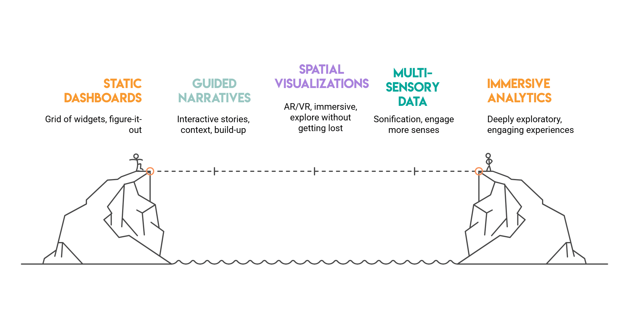
Image by author
# Why are dashboards reaching their limits?
Dashboards are very useful if we want to monitor metrics and KPIs, but they struggle with interactive exploration and true storytelling. Some common limitations include:
- They lose context. A chart can show whether something went up or down, but not why.
- They overwhelm. Too many visuals in one place causes cognitive overload.
- They are inactive. Users view the data but do not interact with it much.
Today’s audience wants more than this. They don’t want to just see numbers on a screen.
If you want to practice turning raw datasets into real business narratives – not just charts – use platforms like stratscratch A great way to develop storytelling intuition is through real-world SQL and analytics problems.
They’re looking for stories that are full of context, flow, conversation, and even a little drama.
Let’s explore four exciting directions where data storytelling is moving.
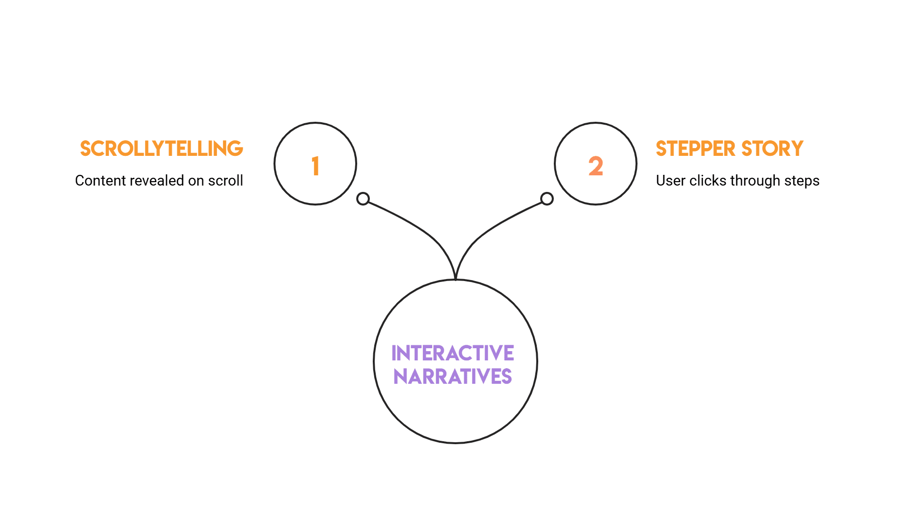
# Interactive narratives: letting data unfold like a story
Imagine that your charts tell a story one chapter at a time. This is the magic of interactive narratives. They combine the structure of storytelling with freedom of exploration.
// How Interactive Stories Really Work (Scrolls, Stages, and Views)
A common and interesting pattern these days is scrollytelling, which combines scrolling and storytelling. It is an online storytelling technique where content is revealed as the user scrolls down the page. This reflects the behavior that users have today when scrolling through their favorite social media websites.
Another common pattern is the stepper story, which we’ll explore in more detail here. The user clicks step by step to see the story develop. An example of a stepper story might look like this:
- Step 1 explains what is happening (e.g. observing trends)
- Step 2 highlights a change point (can be a simple annotation)
- Step 3 compares segments (filter or small multiplier)
- Step 4 Proposes an action (what to investigate next)
// Stepper example with plotly
This example creates a small dataset and turns it into a narrative using buttons where each button reveals a different “chapter” of the story.
import pandas as pd
import numpy as np
import plotly.graph_objects as go
# Sample data: weekly signups with a campaign launch at week 7
np.random.seed(7)
weeks = np.arange(1, 13)
signups = np.array((120, 130, 125, 140, 150, 148, 210, 230, 225, 240, 255, 260))
baseline = np.array((120, 128, 126, 135, 142, 145, 150, 152, 155, 158, 160, 162))
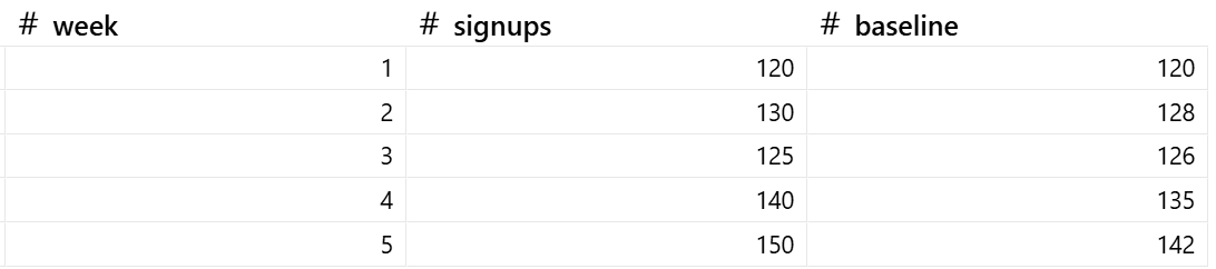
df = pd.DataFrame({"week": weeks, "signups": signups, "baseline": baseline})Let’s inspect the synthetic data first:
Now let’s create an interactive plot:
fig = go.Figure()

# Trace 0: actual signups
fig.add_trace(go.Scatter(
    x=df("week"), y=df("signups"), mode="lines+markers",
    name="Signups", line=dict(width=3)
))

# Trace 1: baseline (hidden initially)
fig.add_trace(go.Scatter(
    x=df("week"), y=df("baseline"), mode="lines",
    name="Baseline (no campaign)", line=dict(dash="dash"),
    visible=False
))

# Narrative steps using buttons
fig.update_layout(
    title="Interactive Narrative: What changed after the campaign?",
    xaxis_title="Week",
    yaxis_title="Signups",
    updatemenus=(dict(
        type="buttons",
        direction="right",
        x=0.0, y=1.15,
        buttons=(
            dict(
                label="1) Overview",
                method="update",
                args=({"visible": (True, False)},
                      {"annotations": ()})
            ),
            dict(
                label="2) Highlight change",
                method="update",
                args=({"visible": (True, False)},
                      {"annotations": (dict(
                          x=7, y=df.loc(df("week")==7, "signups").iloc(0),
                          text="Campaign launch", showarrow=True, arrowhead=2
                      ))})
            ),
            dict(
                label="3) Compare to baseline",
                method="update",
                args=({"visible": (True, True)},
                      {"annotations": (dict(
                          x=7, y=df.loc(df("week")==7, "signups").iloc(0),
                          text="Uplift vs baseline starts here", showarrow=True, arrowhead=2
                      ))})
            ),
        )
    ))
)

fig.show()
Output:
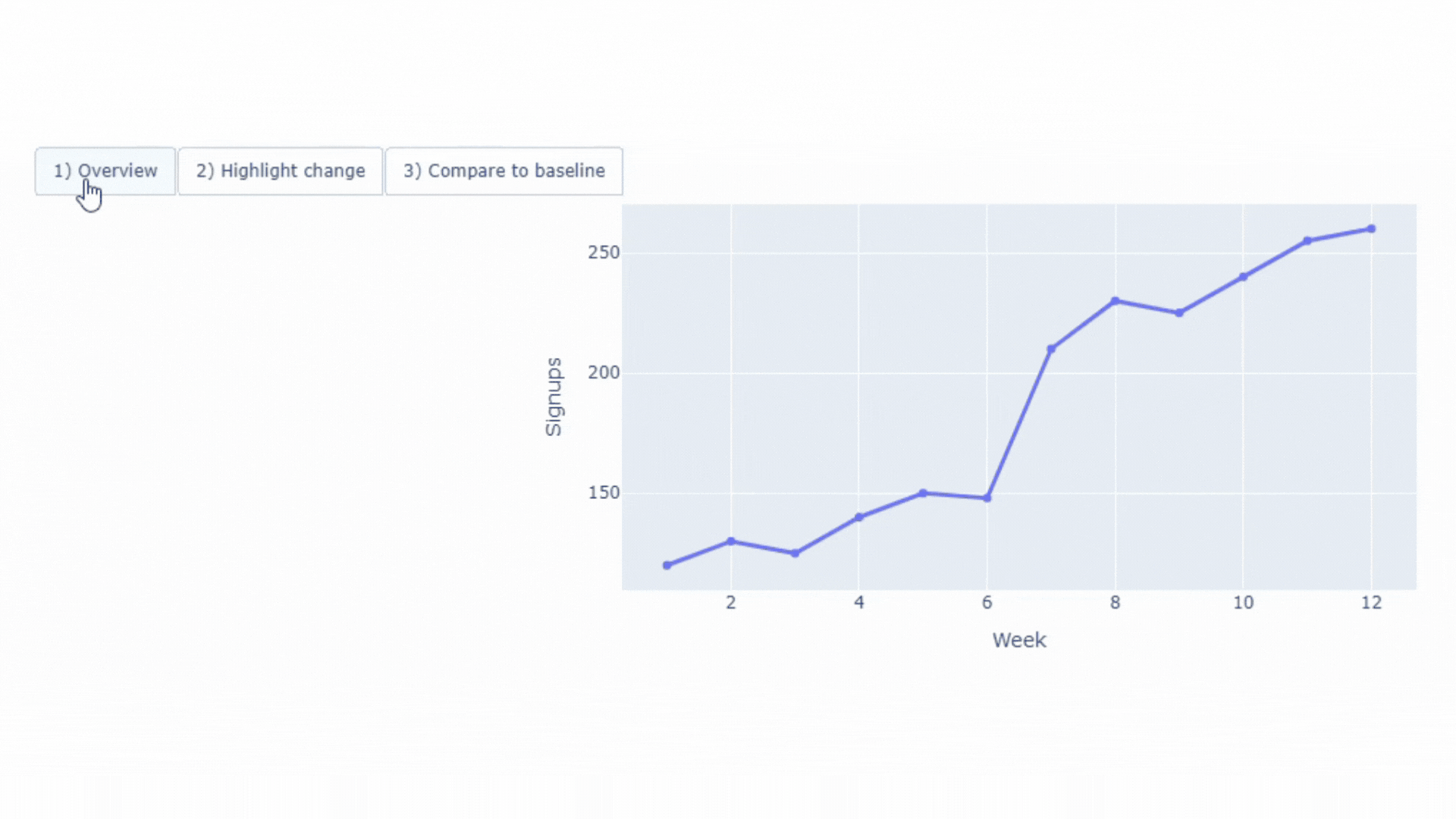
We can see that interactive buttons turn a chart into a guided story. It is clear why this type of scene attracts the public’s attention.
This type of chart works well for product adoption, quarterly reports, investor updates, and other cases where you want to guide the audience. In short, it’s a useful technique when you want people to understand the main point step by step.
# AR and VR visualization: turning data into a space you can explore
AR adds data on top of the real world. For example, one might see numbers or charts on top of real machines or buildings.
VR takes you into a completely digital world. You can move around in the virtual space and explore the data.
Both types of visualizations use 3D space to show data as an environment. The point is not just to look attractive, but to make relationships like distances, sizes and groups easy to understand.
// Where AR/VR are useful
- When our goal is to display information directly on the physical hardware.
- When we want to walk around and see how buildings or cities might look in different situations.
- When we want to investigate the simulation, outer space or microscopic world in three dimensions.
- When individuals want to navigate changes, test concepts, and evaluate outcomes before committing to real-world actions.
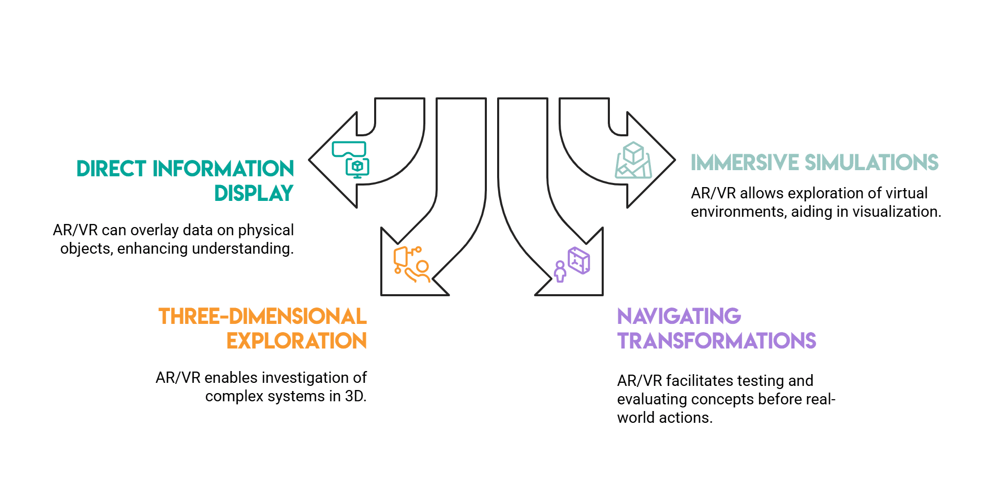
Image by author
// A VR-ready 3D bar chart
here we use frame And webxr To create a small 3D bar chart that runs in the browser. Each bar is a range, and longer bars mean higher values.
The scene runs on a regular desktop browser or in a VR headset that supports WebXR. No complicated setup required.

The output in the browser looks like this:

How to run this example locally:
- save file as
vr-bars.html - Open a terminal in the same folder
- Start a simple local server with Python:
python -m http.server 8000 - Open your browser and go to:
http://localhost:8000/vr-bars.html
It is better to open the file through a local server as some browsers restrict WebXR features when attempting to open raw HTML files directly.
# Sonification: When data becomes sound
Sonification means converting data into sound. Numbers can also become high or low sounds, loud or quiet sounds, or short and long sounds.
One might think that this adds nothing to our data visualization dynamics. However, sound can help us notice patterns, changes, or problems, especially if the data changes over time.
// Best Use Cases for Voice-Based Data Insights
- Monitoring systems (strange or unusual sounds are easy to notice)
- Accessibility (sound helps those who cannot rely on charts or visuals alone)
- Dense time series (rhythms form patterns and sudden spikes are easier to hear)
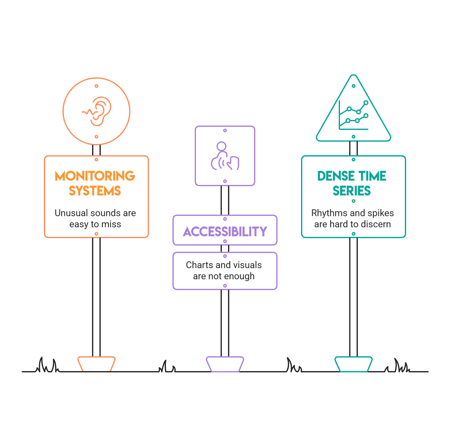
Image by author
// converting a time series into voxels
Here, each value is converted to a musical pitch. Notes are simple sine sounds, with small intervals between them to clarify the sequence.
This version is for Jupyter Notebook (or JupyterLab/Google Colab). it uses IPython.display.Audio To play sound directly into the output cell, so there is no need to install a system audio library.
import numpy as np
from IPython.display import Audio, display

# Example: daily website visits (small time series)
visits = np.array((120, 118, 121, 130, 160, 155, 140, 138, 200, 180))

min_f, max_f = 220, 880  # A3 to A5
v_min, v_max = visits.min(), visits.max()

def scale_to_freq(v):
    if v_max == v_min:
        return (min_f + max_f) / 2
    return min_f + (v - v_min) * (max_f - min_f) / (v_max - v_min)

sample_rate = 44100
note_dur = 0.18  # seconds per note
gap = 0.03       # silence between notes

audio_all = ()

for v in visits:
    freq = scale_to_freq(v)
    t = np.linspace(0, note_dur, int(sample_rate * note_dur), endpoint=False)
    tone = np.sin(2 * np.pi * freq * t)

    # Fade out to reduce clicks
    fade = np.linspace(1, 0, len(tone))
    tone = 0.3 * tone * fade

    audio_all.append(tone)
    audio_all.append(np.zeros(int(sample_rate * gap)))

audio = np.concatenate(audio_all)

display(Audio(audio, rate=sample_rate))
you can hear the output Here.
Click on play to listen to it. When the number of visits is high, the volume is also high, making it easier to hear the spikes.
To turn it into more of a storytelling environment, add a small line chart and highlight key moments like spikes, drops, and trend breaks. A useful addition is to play the audio as the line unfolds over time, so readers can see and hear the change.
# Immersive Analytics: Exploring Data Through It
Immersive analytics is when we explore data in a way that feels like moving and touching things, rather than just clicking on buttons or filters.
Immersivity comes from:
- Data can be visualized in 3D or placed in space, making things easier to understand
- Ability to move sliders, select parts of data, and change views, with data updating instantly
- Changes to one chart cause other charts to be updated as well
// interactive 3d exploration
This example uses plot We can rotate and filter it to show a 3D chart. This is not a standard dashboard; It is a tool for exploring and interacting with data.
Run this in Jupyter Notebook:
import numpy as np
import pandas as pd
import plotly.express as px
import ipywidgets as widgets
from IPython.display import display

# Synthetic multi-dimensional data
np.random.seed(42)
n = 800
df = pd.DataFrame({
    "x": np.random.normal(0, 1, n),
    "y": np.random.normal(0, 1, n),
    "z": np.random.normal(0, 1, n),
})
df("score") = (df("x")**2 + df("y")**2 + df("z")**2)

slider = widgets.FloatSlider(
    value=float(df("score").quantile(0.90)),
    min=float(df("score").min()),
    max=float(df("score").max()),
    step=0.05,
    description="Score ≤",
    readout_format=".2f",
    continuous_update=False
)

out = widgets.Output()

def render(threshold):
    filtered = df(df("score") <= threshold).copy()
    fig = px.scatter_3d(
        filtered, x="x", y="y", z="z", color="score",
        title="Immersive analytics (lite): rotate + filter a 3D space",
        opacity=0.75
    )
    fig.update_traces(marker=dict(size=3))
    fig.show()

def on_change(change):
    if change("name") == "value":
        with out:
            out.clear_output(wait=True)
            render(change("new"))

slider.observe(on_change)

display(slider, out)
render(slider.value)
Here is the output:

To improve this, you can let people select points, show selected rows in the table, or draw lines around groups. This works well when you guide exploration during a meeting. For example, you could start with a step-by-step path, then let the public explore on their own.
# conclusion
The future of data storytelling won’t be entirely about removing dashboards; Instead, we will see a trend toward more interactive and in-depth stories about data, models, and insights.
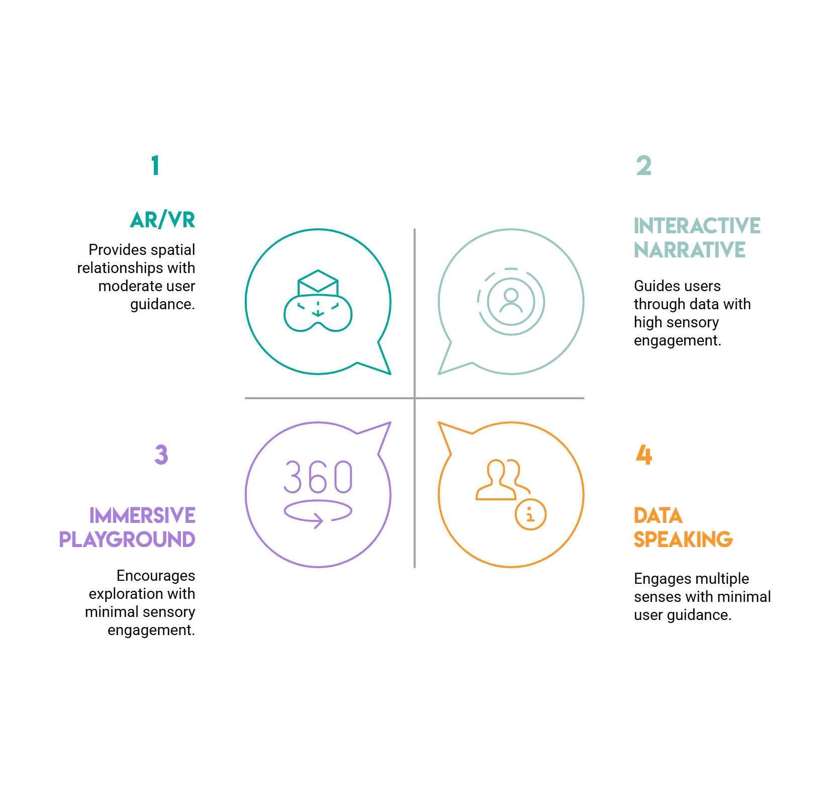
Image by author
In short, here’s how one can choose the best type of data visualization:
- Do you want to mentor someone? Try an interactive narrative.
- Need to show spatial relationships? AR/VR can help.
- Hoping to reach more senses? Let your data speak.
- Want to invite exploration? Create an intense playground.
The best part is that you don’t need a big budget or team to try it.
Pick a technology and make a small prototype. A small stepper or a 3D bar, a sonified line chart or a slider-based filter. You’ll be surprised how quickly your data starts to feel like a story.
Nate Rosidi Is a data scientist and is into product strategy. He is also an adjunct professor teaching analytics, and is the founder of StratScratch, a platform that helps data scientists prepare for their interviews with real interview questions from top companies. Nate writes on the latest trends in the career market, gives interview advice, shares data science projects, and covers everything SQL.